This page is about the design of the site
Design for marketaudiences.com
Matt’s day job is with Conversationware Ltd, a UK web marketing operations and content design company, so we had fun with it.
Angelu made this site design, it is available if you would like a version of it in WordPress.
This dedicated page for the site design, it serves as a reference for colours, fonts, image sizes, logos and recording the brand direction.
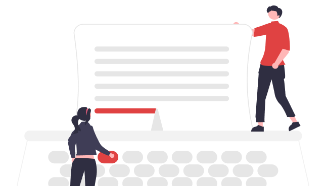
A website is only used when it’s easy
About this Design System
A Design System is a set of standards and elements that helps designers manage design at scale using reusable components and patterns. This is where we record elements of the website and brand design.
This is a resource in future for anyone working on the site or recording the brand thinking and direction.
Logo Design
From SearchAudiences.com to MarketAudiences.com
We originated in search, but that positioned what we do too narrowly. The application of insight into what people want and who they are helps marketing and sales with positioning,
Below is a history for SearchAudiences.com
In case we go back to it someday.
Considering a logo design is fun and symbolic. Ideally, we get an Icon for the site that works well in the browser tab and across other marketing materials.
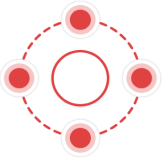
The original Search Audiences logo was conceived with several iconographic ideas:
- The points on a compass, finding direction whilst searching
- The idea of gravity, a central big planet has an attraction (moons).
- We have 4 elements to improve website performance, a continuous cycle of improvement
Finally, in joining the dots together, we are signalling community and education. We decided to nod at the Conversationware logo, symbolising growth through measurement and climbing upwards.
Ideas before we chose the bottom right version.
Favicon Design
The favicon is something unique to find the tabs you are working on. They also serve as ‘monikers’ a ‘nickname like’ short way of tagging the brand.


Website Decision Architecture Layout
The design is for the visitors. How we organise the information is the realisation of why people are on a site in the first place. Part of understanding visitor audiences intent, is to guides you in prioritising and organising your site to serve them.
It is the Content Design that converts visitors through the concept of conversation.
Responding to visitors through the power of search is much easier than guessing what we should say; and there are patterns to follow.
Here are some of the considerations
Navigation
The website navigation is how the user interacts, how we anticipate their needs, ask them questions and how they seek value.
“Don’t make me think” is a central philosophy we picked up from the book of the same name. We celebrate breadcrumbs and sidebar navigation as tools for the visitor to give vital context to what they are reading. It’s the visual hierarchy combined with knowing how minds work.
Our Colour Scheme
The Search Audiences colour scheme is a combination in harmony with the brand and company, marketing and capturing attention. The action-orientated nature, energy and vibrancy is in contrast to the understated clarity of the clean layout.
We wanted impact without clutter, and to better demonstrate some of the concepts of navigation and readability with the clarity it brings.
Accent Colours
#e04242
Accent – Red
#FF4F4F
Alt – Light Red
Contrast Colours
#283134
Strongest Text
#424242
Medium Text
#666666
Subtle Text
#E7D8D8
Lines
Base Colours
#FFC7C7
Subtle BG
#FFF8F8
Lighter BG
#FFFFFF
White
Red being the most dominant colour will be used for Call to Action buttons and links to attract the users attention. Other colours like Black and Dark Grey for the headers and paragraphs.
Typography
Readability is the most important factor when designing a website.
Sites with hard-to-read fonts don’t get read enough. The Market Audiences website will have huge amounts of content which means, selecting an appropriate size, pixel, and font for the text has been where we spent the most time.
The proportion makes it beautiful.
Header 1
The quick brown fox jumps over the lazy dog.
Header 2
The quick brown fox jumps over the lazy dog.
Header 3
The quick brown fox jumps over the lazy dog.
Header 4
The quick brown fox jumps over the lazy dog.
Header 5
The quick brown fox jumps over the lazy dog.
Paragraph Text
The quick brown fox jumps over the lazy dog.
Button Text
The quick brown fox jumps over the lazy dog.
Graphics, Illustrations, and Icons
All graphics and images used in this website are from Unsplash, Pexels, and unDraw. These are open source websites that allows our designers to get free access to different images and illustrations that they need to design any project, commercial or personal very quickly.
For the icons used in this website, we used FlatIcon. Flaticon is a database of free vector icons and stickers. Flaticon offers a wide catalogue of free icons in PNG format but if you want more accessibility, they also offer a premium subscription you can subscribe to.


Intro training for market audiences
Add your email to the list, and we’ll invite you to an introductory walk-through.
The foundation of web marketing
WordPress is just the Engine?
We love WordPress through its continuous progress to provide low cost of ownership and rich functionality to its market-leading share of the internet user base. The open-source model of software makes sense.
Just like the engine of a car, WordPress is surrounded by other components that can either maximise performance or drag it down. The chassis, tyres and drive are performed by the theme.
Kadence Theme
We abandoned the 10 years of Genesis Theme and Beaverbuilder page builder for the Kadence theme. WordPress needed to be faster to get more performance (+100% more leads in some cases). It was a big decision. We narrowed it down to two really fast themes, and then Kadence won on it’s future tech leadership.
The Kadence direction put the user in charge, and it fully embraced Gutenberg, the future WordPress editor.
At the time, WordPress were replacing the engine whilst the aeroplane was still flying. But, now we see why Gutenberg editor, together with Kadence will win. We look forward to the disappearance of the slow world of page builders like Divi and Elementor…. soon.
Website Content Management
The ability to create content and get it published is a key element to any marketing plan. The friction that comes from different teams and people involved slows things to a crawl.
Having a team that consistently uses the same highly functional and easy-to-use WordPress and design systems makes all the difference. Don’t keep swapping horses, don’t keep finding shiny tools, just create content around the interests of the website visitor. The more you do, the easier it gets.